Most blog graphics that look “off” are not failing because of their colours or their photos. They are failing because of their fonts. A headline font that fights the body font, three different typefaces in one image, or a pretty script used for a whole paragraph can make good content look amateur in seconds.
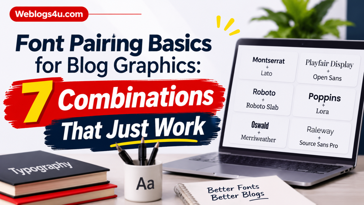
The fix is simpler than most bloggers expect. You only need two fonts per graphic: one for headings, one for body text. The heading font carries the personality, the body font carries the readability, and the two should contrast without clashing. Below are seven pairings that do this reliably. All of them are available in Canva, including on the free plan, and each one suits a different kind of blog.
Three ground rules before the list
First, let the heading do the talking. Your heading font can be bold, elegant, or playful, but your body font should always be plain and easy to read at small sizes. Second, keep the size gap clear: a heading at least twice the size of the body text almost always looks deliberate, while sizes that are close together look accidental. Third, once a pairing works for you, reuse it across your whole blog. Readers start recognising your graphics before they read a word, and that recognition is worth more than variety.
1. Playfair Display + Montserrat (editorial)
Playfair Display is a high contrast serif with a magazine feel, and Montserrat is a clean geometric sans that stays out of its way. Together they read as polished and calm, which is why this pairing suits lifestyle, food, travel, and personal development blogs.
Set the Playfair headline in title case at a generous size, and keep Montserrat body text at a comfortable reading size with a little extra line spacing. The watch-out: Playfair’s thin strokes can disappear at very small sizes, so keep it for headlines only, never for captions.
2. Anton + Open Sans (bold and direct)
Anton is a heavy, compressed display font that shouts a little, in a good way. Open Sans underneath it stays neutral and readable, so the graphic feels confident rather than chaotic. This pairing suits how-to blogs, tech blogs, and any niche where the promise matters more than the mood.
Use Anton in all caps for short headlines of five words or fewer, because long headlines in Anton get tiring fast. Open Sans at a normal weight handles the supporting line. If your headline needs to be long, this is not your pairing, pick the next one instead.
3. Bebas Neue + Lato (clean and modern)
Bebas Neue is tall, narrow, and all caps by nature, which makes it perfect for fitting long headlines into tight blog banners. Lato is a warm, friendly sans that softens Bebas just enough. Marketing, productivity, and business blogs get a lot of use out of this pair.
Because Bebas takes so little horizontal space, you can set it large without the headline wrapping onto three lines. Add a small amount of letter spacing to the Lato body text if it sits under a big headline, it helps the two blocks feel like separate layers rather than one blob.
4. Dancing Script + Josefin Sans (friendly and personal)
Every blog seems to want a script font somewhere, and this is the safe way to do it. Dancing Script has a handwritten, bouncing feel that works beautifully for a short headline or a single highlighted word. Josefin Sans, geometric and light, keeps the rest of the graphic grounded and legible.
The rule with scripts is strict: headlines and accents only, never body text, and never more than a few words. A whole paragraph in Dancing Script is where readability goes to die. Craft, baking, parenting, and journaling blogs will find this pairing feels like it was made for them.
5. Oswald + Merriweather (classic blog)
Oswald is a sturdy, slightly condensed sans that reads like a newspaper headline, and Merriweather is a serif designed specifically for comfortable screen reading. Together they give a graphic the trustworthy feel of a well established blog. Personal finance, education, and long form writing blogs wear this pairing well.
Oswald works in both title case and all caps, so it is more flexible than Anton or Bebas when headlines vary in length. Merriweather’s slightly chunky letterforms stay clear even in longer description lines under a pin or a banner.
6. Archivo Black + Arimo (strong promo)
Archivo Black is about as heavy as a font gets, and it is built for announcements: launches, freebies, sales, and lead magnets. Arimo, a clean sans in the Arial family style, keeps the details readable underneath. If you make opt-in graphics, webinar banners, or product covers, this is your pairing.
Because Archivo Black is so wide, keep headlines short and give them room. Two or three words per line, stacked, looks strong. Crowding it with a long sentence is the one way to make this pairing fail.
7. Cinzel + EB Garamond (formal and timeless)
Cinzel is carved, classical, and quietly expensive looking, based on Roman lettering. EB Garamond is its natural partner, a bookish serif that reads like a printed page. History, literature, genealogy, wedding, and heritage recipe blogs all suit this pair, anywhere a formal tone is the point.
Use Cinzel sparingly and with generous letter spacing, it rewards space. EB Garamond runs a little small compared to other fonts, so set the body text one size up from what you would normally use.
Choosing your one pairing
You do not need all seven. Pick the one that matches your blog’s personality, save it as a small template in Canva with your headline and body styles set, and reuse it until it becomes recognisably yours. If you want a wider shelf of options to test, this collection of the best Canva font pairings shows more combinations in the same heading plus body format. The best pairing is rarely the fanciest one. It is the one your readers can read at a glance, every single time.
Author bio
Henry Tyson writes beginner friendly Canva and design tutorials at The Vistly, covering fonts, templates, and simple workflows for bloggers and creators.