
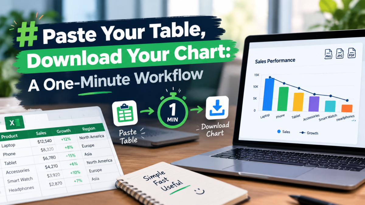


Most chart tutorials start with a twenty-minute setup: install a plugin, create an account, learn a dashboard. But the actual job is usually much smaller — one clean chart for one slide, built from a table you already have in Excel or Google Sheets. The fastest workflow I have found skips the setup entirely: paste the table into a browser page, pick a chart type, and download the finished image. A free chart generator at Table To Chart follows exactly this pattern, turning pasted spreadsheet data into presentation-ready statistical graphics in under a minute.
Start From the Table You Already Have
The practical starting point is never a blank canvas; it is the messy table sitting in your spreadsheet. Sales figures by quarter, lab measurements by trial, survey responses by category — the numbers already exist, and retyping them into a chart tool is pure waste. The paste-first approach reads the table structure automatically: copy a range from Excel, Sheets, or any CSV source, drop it into the editor, and the rows and columns land in the right places. You can also upload an xlsx or xls file directly when the dataset is too large to copy comfortably. The editor grows with the data, so nothing needs manual resizing when a twelve-row table becomes a forty-row one. This sounds trivial until you have done it the other way — defining series one by one in a desktop chart wizard, clicking through dialogs for every label. For the common cases, students formatting lab results for a hand-in, teachers preparing a lesson diagram, or an analyst cleaning up a quick export, the difference between pasting and rebuilding is the difference between a one-minute task and a twenty-minute one.
Eleven Chart Types Cover the Real Cases
A tool that offers three chart types forces every dataset into the same shape; a tool that offers fifty buries you in choice. Eleven turns out to be a workable middle. Trend-over-time data belongs on spline, line, or area charts, where the eye follows the slope. Side-by-side comparison calls for column or bar charts, which make magnitude differences obvious at a glance. Proportional composition — market share, budget splits, survey distributions — reads best as pie or dual ring charts. The longer tail matters too: scatter charts reveal correlation in paired measurements, radar charts compare multi-dimensional profiles like skill assessments or product benchmarks, heatmaps expose patterns in dense matrices, and funnel charts walk a reader through conversion stages. Every type renders instantly on selection and exports at high resolution, so switching from a column chart to a radar chart to see which tells the story better costs one click, not a rebuild. My rule of thumb is to try two types for any important chart; the second attempt almost always reads more clearly than the first guess.
What the Tool Refuses to Do Is the Feature
Free utilities usually monetize through friction: mandatory accounts, watermarks stamped across exports, half the menu locked behind a pro tier, countdown timers pushing an upgrade. The design here goes the other direction, and that absence is what makes the workflow fast. No sign-up means no email address handed over and no login wall before the first chart. No watermark means the downloaded image goes straight into slides or documents without cleanup. No tiered chart types means the heatmap and funnel options work the same way the basic line chart does. There are no trial traps or upgrade pop-ups interrupting the export step. This matters most for one-off users — a founder who needs a single chart for a pitch deck, a marketer dropping one graphic into a weekly report, a small-business owner who refuses to buy another subscription for a five-minute task. They need a chart, not an account, and the tool treats that as the entire requirement rather than the top of a sales funnel.
Keep Sensitive Data in the Browser
The part people underestimate is where their numbers go. Pasted tables are often sensitive: internal revenue figures, student grades, research measurements, client metrics. Many browser tools upload that data to a server for processing, which creates exposure nobody asked for. Rendering everything locally in the browser avoids the problem structurally — tables and charts are never uploaded, never logged, and never stored on a remote machine. Closing the tab ends the session completely. Combined with the no-signup design, this means there is no identity attached to the data either: no account record linking a name to a dataset. For classroom use, for client work, and for anything covered by a data-handling policy, that property is worth more than another dozen chart templates. Paste the numbers, render the chart, download the image, close the tab — the workflow leaves nothing behind except the finished graphic.
Author: Table To Chart (https://tabletochart.com) — free online Excel-to-chart generator, no signup required.
Contact: webbase@foxmail.com
Thanks for your consideration!